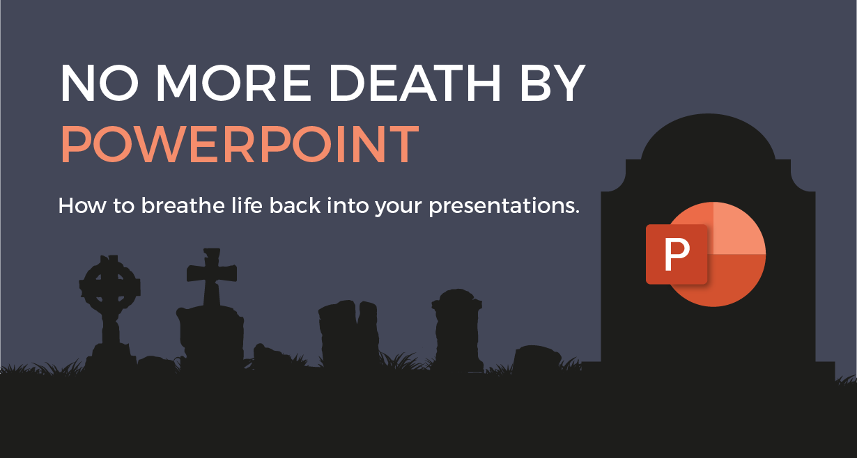
No more Death by PowerPoint. How to breathe life back into your presentations.
No more Death by PowerPoint. How to breathe life back into your presentations.
It feels like some things have been around forever. Can you think what life was like before PowerPoint? We used to write stuff on a flipchart or whiteboard like some kind of savage.
Watching Brian from Accounts trying to draw a graph with no straight lines was a joy to behold. Living through Helen’s fever-pitched sales presentation featuring lots more charts with upward lines was something we relished. And who can forget Graham’s new product development pitch with drawings printed out and taped to a whiteboard?
But then all that changed when PowerPoint arrived on the scene, and business meetings were never quite the same again.
Where did PowerPoint originate?
Most people think that PowerPoint is a Microsoft development, but it isn’t. PowerPoint was created and developed by a Silicon-Valley startup called Forethought Inc. They started developing it in 1984 under the (not very imaginative) name “Presenter”. Eventually, they needed more money to develop it and became the first investment for Apple’s Strategic Investment Group, who saw desktop presentation as the next big thing.
It first released in 1987 for computers running the Mac OS but couldn’t use the name Presenter as it had already been trademarked. Legend has it that they came up with “Power Point” as it empowered the presenter. Although lead developer, Robert Gaskins, says he randomly came up with “Power Point” while in the shower.
Whichever was the case, the Macintosh naming convention led to it being all one word with the capital P in the middle, and PowerPoint was born.
How did PowerPoint become a Microsoft product?
The original purpose of PowerPoint was to create slides for overhead projectors. Those of a certain age will remember the pain of creating transparent acetates for presentations. PowerPoint made it easy to create a slide which could be printed out then copied onto an acetate.
Early in 1987, Microsoft started work on a desktop presentation software. They were thinking about acquiring a program called More to speed up development, then they heard about PowerPoint. Bill Gates was sceptical about having a dedicated presentation program and wanted it to be a feature within Word. He was persuaded it needed to be a stand-alone piece of software and they bought Forethought for $14m in July 1987.
As well as acquiring the software, it also gave Microsoft a physical presence in Silicon Valley as PowerPoint was the first product to be based away from Microsoft’s Washington HQ. The Forethought development team moved over to Microsoft and “PowerPoint for Macintosh v2.0” was released in 1988. A couple of years later the Windows version was released to coincide with Windows 3.0.
The start of Microsoft Office
PowerPoint 3.0 was released in 1992 and featured the use of live video for projectors and computer monitors. Version 3.0 is important because it now allowed the presenter to deliver their presentation as well as prepare it.
The various applications we now know as MS Office were originally stand-alone products. But now Word, Excel, and Access had PowerPoint as another sibling to the fledgeling Office family.
Up until 1993, Office had only been a bundling promotion which offered the individual applications for a discounted price in one package. PowerPoint 2.0 had been included in the Office bundle in 1989, as was the Windows version the following year. As early as 1991, Microsoft had indicated that they planned to integrate the individual software items as one big application. But it wasn’t until PowerPoint version 4.0 that the integration came into effect.
Sitting alongside Word 6.0, Excel 5.0, and Access 2.0., PowerPoint 4.0 had the same user interface formatting to match the other office applications. They just needed to match the version numbers as it played havoc with everyone’s OCD.
PowerPoint 95 (technically PowerPoint 7.0) aligned all the versions of each application, and Microsoft Office was ready to evolve into the software we know today.
Top 3 Tips for Effective Presentations
Over the years, PowerPoint has turned into a feature-rich presentation application. In the hands of a talented presentation designer, it’s possible to create beautiful presentations to compliment the presenter’s words perfectly.
In the hands of the average user, it’s possible to create the most diabolical, unholy monsters imaginable.
At one end of the scale, there’s the Wall-of-Text style. Page after page of black text on a white background that the presenter painstakingly reads out the audience, who’ve already read it on screen.
At the other end of the scale is the Animation Enthusiast. Spinning transitions, bouncing titles, light text on light backgrounds, and cursive fonts are all fair game—the end resulting being a distracting mess, rather than a clear, informative, piece of communication.
Rule 1 – Uniform Formatting
Choose a font for your titles and use either the same or a complementary font for your body text. There are plenty of online resources to help you with your font pairing.
Also, keep the font size and colour scheme consistent throughout the document.
Rule 2 – Keep it Simple
There are no limits to how many slides you can have in a presentation, so don’t try and cram too much information onto any one of them. A packed slide with graphs and multiple bullet-points needs a lot of concentration from the reader. When they concentrate on the slide, they aren’t listening to you. So use the slide to complement your words. A single, full-screen picture with a single line of text can communicate as much as a whole page of text if you do it right.
Stick to making one main point per slide and don’t worry about how many slides you have in the presentation. Thirty slides that glide by quickly are more interesting than five that remain on the screen for several minutes each.
Rule 3 – Use Animations Sparingly
Just because there are hundreds of animations, it doesn’t mean you have to use them all. The two main types you need to focus on are the transitions between slides and each element’s appearance on the slide. Keep both of them subtle. A simple fade from one slide to the next is perfect, as is text that gently appears into view on the slide. Bouncing boxes and spinning transitions are distracting. They move the reader’s focus away from the content and onto the style, which is the wrong way around.
PowerPoint doesn’t have to be a dirty word. It is possible to create attractive, engaging, presentations when done correctly. At Brand Adapt, we have made many presentations for all sizes of companies and purposes. We can create full presentations or just the visual style to use a template for clients to add their own text.
Contact us to discuss your presentation requirements.