How video game design reflects the console manufacturer’s ethos
How video game design reflects the console manufacturer’s ethos
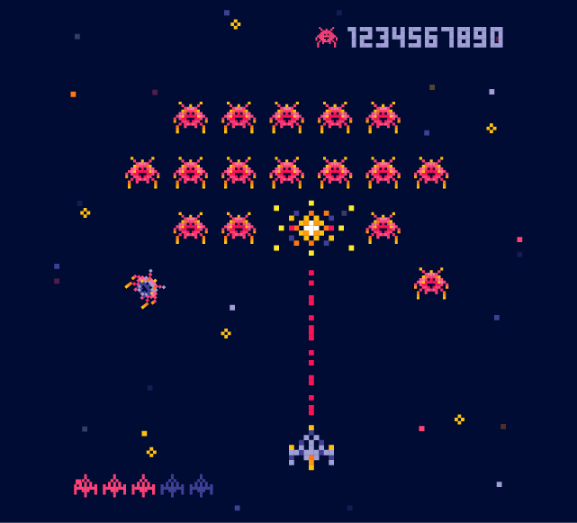
In our last blog, we looked at the early advent of video games from Pong in 1972 to the NES in 1985.
It’s fair to say a lot happened during those years. But it was nothing compared to what happened next.
Graphic design in the 16-bit era
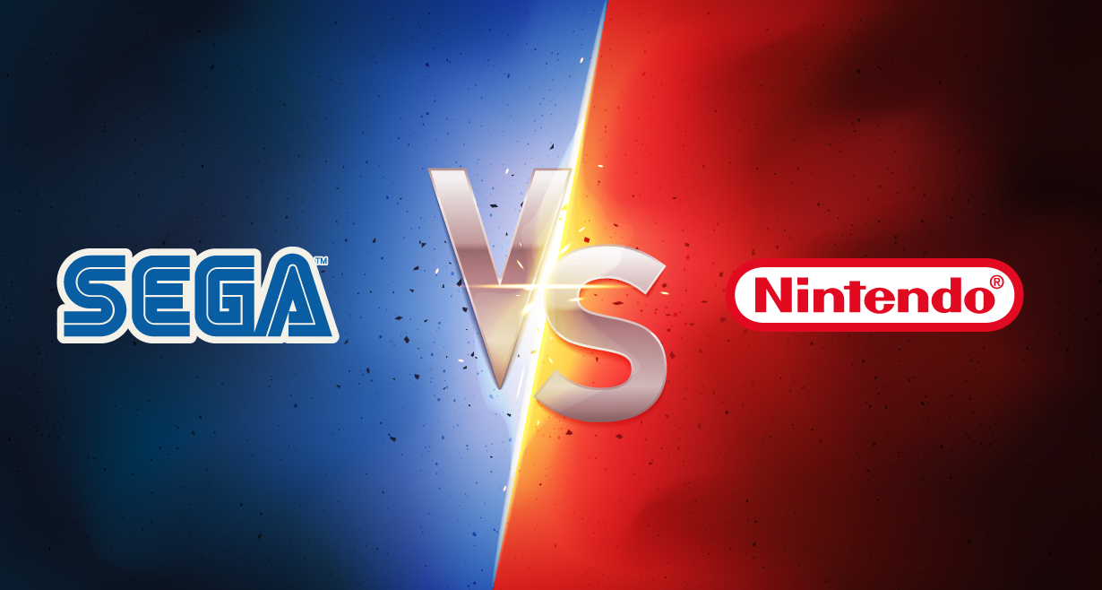
The 16-bit era arrived. Sega burst onto the scene with its best-selling console of all time – the Mega Drive. Capitalising on the success of the Nintendo Entertainment System (NES) in 1985 Nintendo needed a console to rival the Mega Drive. After what must have been a tough half-hour’s work in the Nintendo marketing department, they came up with the Super Nintendo Entertainment System (SNES) which launched in 1990.
SNES v Mega Drive
SNES v Mega Drive was the main event. Nintendo favoured a softer, more family-friendly approach which is encapsulated in its chief emblem, Mario. Sega took a different approach. It wanted to be more edgy and radical. Sonic the Hedgehog was aiming to be hellishly cooler than Mario.
Character design of Mario and Sonic
When you look at the design of those two protagonists, the ethos of the console makers is there to see. Mario is more rounded. His colour palette uses softer colours, emphasised with small amounts of blue and red. Every part of him is soft and curvy. He’s a playful character and the cuddly toy for the younger kids.
Sonic is sharp. He’s jagged, angular and pointed. Cuddle Sonic, and you’d never play a video game again. His colour palette is blue. Bold, definite blue. He’s there to appeal to older kids and teenagers. Sonic has attitude. He’s the bad boy rebel.
The loading screens for Super Mario and Sonic the Hedgehog emphasise their characters even more. Mario is trundling around bouncing on plants. Sonic just stands there tapping his foot.
Even the design of the two consoles shows the intention. The SNES was mainly light grey with some darker grey highlights. The Mega Drive was black. Jet black. It was the bad boy of the console world, and Sonic was the poster boy.
While Mario and Sonic battled it out for control of the platform game world, two other games rose to the fore. Street Fighter 2 and Mortal Kombat.
How did Street Fighter 2 and Mortal Kombat reflect the console makers?
Like Mario and Sonic, the character design in those two games reflects the ethos of the console maker. The backgrounds in SF2 are beautiful. Again, they’re bright and colourful with a high level of detail. Street Fighter 2 characters are almost cartoonish. They’re colourful and well defined. Like Mario, they’re rounded. While most of them obey everyday physics, some don’t. Who can forget Dhalsim’s stretchy limbs?
To fit in with Nintendo’s global appeal, each character had to have originated from a particular country. Their fighting style had to reflect that country in some way. Anyone on the receiving end of Japanese sumo wrestler E. Honda’s hundred-slap sumo move will relate.
Nintendo’s insistence on family appeal created one of the leading visual details of SF2. No blood. After three rounds of smashing the bejesus out of each other, both characters still looked as fresh as they did at the start.
As for the gameplay, SF2 is simple in concept. Two fighters slug it out in a best of three contest. To win, one character has to reduce the other character’s life bar to zero, and that’s it. No big end to the fight, just one character standing over the other.
Mortal Kombat took a very different approach. They went dark.
While there are generally goodies and baddies in both games, all of MK’s characters are dark. Arguably the goodies are only less bad than the baddies.
As SF2’s characters were hand-drawn, MK’s were video-captured avatars which gave them life and realism. You can see the inspiration from Bruce Lee films in the look and feel of the whole game, which takes place in a fictional realm.
The difference between SF2 and MK
But the main difference was the gore. MK was never going to be published by Nintendo. The Mega Drive was their playground, and they didn’t hold back. They didn’t like fights only ending with one character standing victoriously over the other. They wanted the victor to definitively end the loser. And they achieved this with the introduction of finishing moves or “Fatalities”. Before the losing fighter fell, the winner was offered a window of opportunity to carry out their character’s special finishing move.
To say there was some controversy around the finishers would be an understatement. Depending on your character, you could rip your opponent’s spine, punch their head off, or set fire to them and watch them explode.
Gamers flocked to the Mega Drive to get this new, brutal take on the beat’em up genre and Nintendo couldn’t ignore MK. However, it gave them a significant problem. How could it fit with their family-friendly appeal? The answer was recolouring all the blood to grey, which they said was sweat. The programmers also had to tone down many of the finishers, and the result was it mainly being ignored on the SNES.
Gamers loved the gore. Parents hated it. And the debate about violence in video games began.